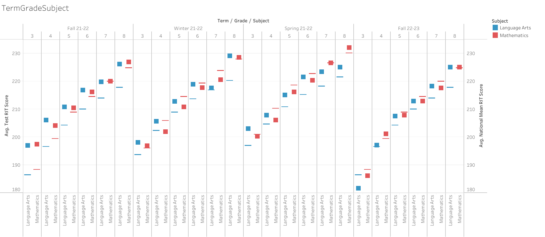
Evaluation results compared to expected results by grade and then subject, illustrating:
Student averages (blocks) compared against national averages (bars) over the year
Comparing how each age range (grade) responded to each product (subject area) so that future efforts can be focused within age ranges (grades).
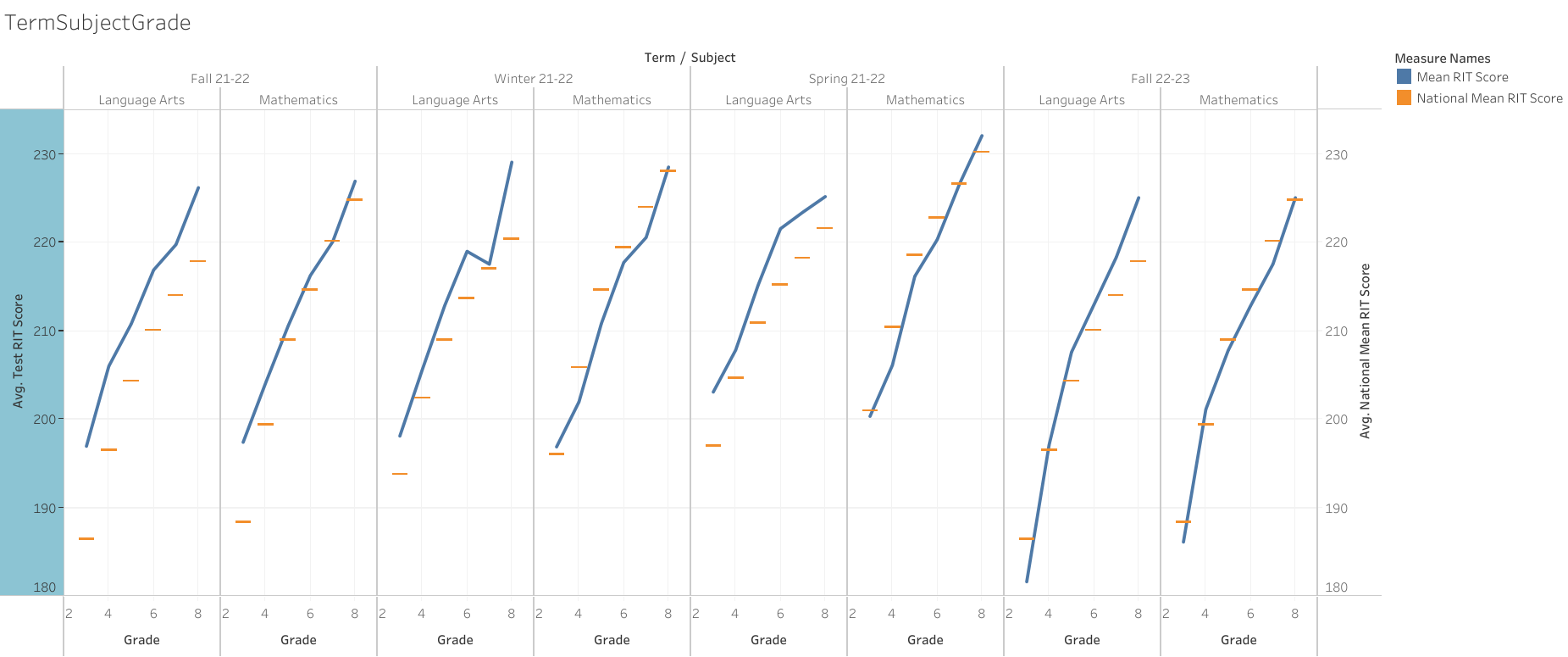
Evaluation results compared to expected results by subject then grade, illustrating:
Student averages (blue) compared against national averages (orange) over the year
Showing how age ranges (grades) responded across each products (subject areas) so that future efforts can be focused on products (subject areas).
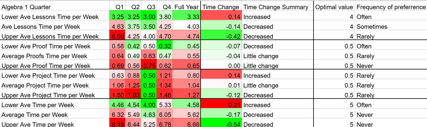
Bottom left: survey responses about perceptions of time spent are organized in a heatmap, illustrating:
optimal (green) and suboptimal (red) perceptions.
Showing where future product (assigment) changes will have the greatest impact for clients (students).
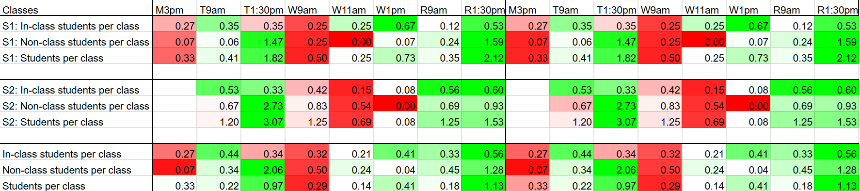
Bottom right: attendance records organized in a heatmap, illustrating:
optimal (green) and suboptimal (red) class times.
Showing how future scheduling choices can make optimal use of employee time.